Hanan R. Alnjar1*
1, Department of Computer science, College of science, University of Basrah, Basrah, Iraq
E-mail:
hananalnjar73@gmail.com
Received: 16/01/2020
Acceptance: 23/04/2020
Available Online: 16/05/2020
Published: 01/07/2020
Manuscript link
http://dx.doi.org/10.30493/das.2020.216111
Abstract
Metrics are standards or ways to measure or evaluate something. Metrics are used in a variety of fields, for instance, they are used in the field of graph drawing to help position aesthetically pleasing graphs. There is much potential for using metrics in data visualization. This potential not only can help to layout and position the visual depictions better but also assets visualizations creation which is quicker to understand or calculate values that determine the similarity and differences of two visualizations. However, little research has been performed to investigate and clarify where and how metrics can be used in visualization. In this work, the usages of metrics visualization were investigated through a series of case studies.
Keywords: Visualization techniques, Quality metrics, Clusters, Graphical data, Multivariate data
Introduction
The field of data visualization covers a wide range of techniques and algorithms from the simple visual data representations to the complex three dimensions (3D) data animation applications. The goal of visual design is to create high quality, clear, easy to understand, and quick to perceive depictions. Therefore, the quality of the created visualization has always been a principal motivator for researchers. It is therefore crucial to use different types of judgments that could be applied to the visualization to reach the needed quality.
Clarity is an important dimension as the significant role of visualization is to convey information effectively to the users. The process of conveying the data needs clear and suitable tools as well as a means to facilitate the visualization understanding process. Metrics can, therefore, help in the visual creation process. A good example of a visual metric is calculating edge crossings in graph layout when the crossing number cr(G) of a graph G is low, it gives a good indication of edge crossings. The seven aesthetics criteria have been defined by [1] as follow: minimizing edge crossing, minimizing edges ends, angles, maximizing symmetry, maximizing the minimum angle between edges leaving a nod, maximizing edge orthogonality, maximizing node orthogonality, and maximizing consistent flow direction (directed graph only). Accordingly, this criterion can be used as metrics to layout graphs better; making them more aesthetically pleasing and better to comprehend.
Metrics can also be used to evaluate the effectiveness of the visual depiction. Comparison metrics, such as just-noticeable-difference (JND) or Weber’s law of perceptual change [2] can help users measure aspects of the visual depiction. Various visualization techniques use metrics to perform different tasks on data or image space. For example, in data space, users can calculate the degrees of correlations between data points in parallel coordinate technique by demonstrating the intensity of lines at these points and thereafter, detect the shape of the clusters with its directions. Additionally, irrelevant data points and outliers is an easy task [3].
There are many reasons why metrics can be useful and directly used by a human. In particular, calculating metrics on sheets of paper may be a useful technique to get learners to understand the processes better and what is required to calculate a metric. Developers can benefit from estimating metrics in their minds, because it can help to confirm whether the idea is good or bad. Some metrics are easier to calculate by hand, while others would be nearly impossible to calculate this way. This challenge depends on the calculation and the type of task that the user is requiring to be solved.
Data visualization consists of various types of metrics and many of these metrics have been proposed during the last three decades. Metrics are widely used in different domains, such as multi-dimensional data, and graph drawing visualization. Metrics range in their use, from being part of an algorithm to create better visual depictions with less clutter, to helping developers ascertain which visual depiction is better. Furthermore, using different types of metrics together could help users to select the best visualization for the right task. For example, visualization designers can classify different aspects of the visual scene by metrics. From this viewpoint, visualization metrics can be defined as the metrics that are calculated to measure the attributes and capture the properties of visualization, to extract the meaningful information of data.
Standard measures are commonly well known in physical science. Measuring the attributes of objects is subjected to some standards (e.g. magnitude, dimensions, and uncertainty) which are the basic criteria that define the object description. For example, colors can be measured based on the reflected light wavelengths (quantitative) and qualitatively described as ‘green’, ‘red’, ‘yellow’ as people can recognize these terms. All measurements have units that refer to their quantity metric and to the object’s type (e.g. time, weight, and distance). Metrics can be assigned to a single value or a range of values. Additionally, physical science measurements mainly refer to the quantitative scales and that is attributed to the nature of physics which is based on mathematical principles and standard numeric fundamentals. Therefore, visual metrics can be classified into quantitative and qualitative measures.
Throughout the past 30 years of visualization research, different types of metrics were used. One of the early researches on using metrics was [4]; this study consisted of a measure to estimate the graphical area that refers to the size of effective data information in two dimensional (2D) static images. Two well-known metrics of data-density (the ratio of data-items to space) and the data-ink-ratio (proportion of ink that represents data, to ink that is used by chartjunk) were created. [5] expanded this proposal by proposing several metrics to identify the complexity within 3D static image and particularly referred to the occlusion as a measure of that complexity. Several research papers categorize and classify visualization metrics, but these researchers have focused on specific areas or general use of metrics [6]. Evaluations in visualization need to use combinations of different types of metrics to comprehend visual design attributes as possible. Recently, [7] studied different quantitative measures used for the analysis of cartogram algorithms to visualize geographical distributions of data clearly and evaluate how cartograms could simulate the real area value on the desired region. Furthermore, metrics can benefit the evaluation criteria on performance comparison measures between visual data features in different visualization works [8][9][10], and users can generate evaluations on new versions of that visualization.
In information technology, images are considered an effective medium to represent and use data. Assessing the quality of images needs many measures or metrics, one of the criteria that used with assessment quality is comparison space. In comparison space, metrics can compare the magnitude of difference between different images, and that aspect can be taken with different perspectives such as aesthetics aspect in terms of color consistency, patterns, and texture [11][12], or geometrical aspects [13].
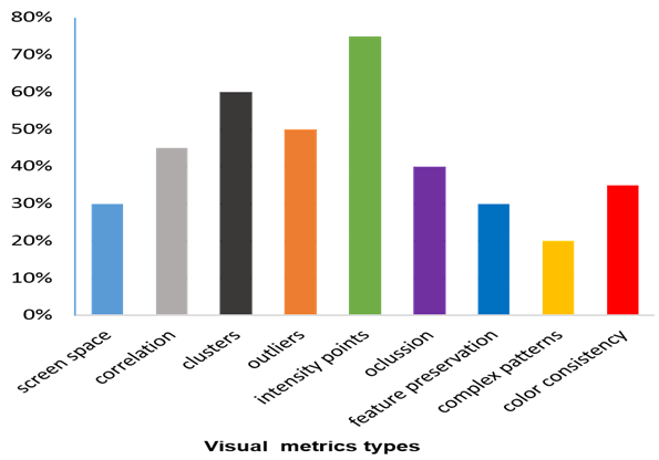
The color-image quality assessment considers a large research area and many studies have focused on the conceptually based metrics which provide a comparison criterion with the human visual system [14]. Several metrics are introduced in space comparison as a set of user-defined metrics to assist the image quality evaluation process. Metrics were previously classified by type including screen, correlation, cluster, outlier, occlusion, feature preservation, density, and clutter. Previously, [15] extracted data visualization metrics from different domains and organized them in tables. In this research, details were collected from a wide range of visualization researches under different titles such as visualization techniques, data type, domain, and measuring category. The measuring categories are shown in (Fig. 1) which describes the distribution of metrics as bar charts, from the inspected literature with distribution estimations of these metrics as percentage values to show the frequency of every metric usage for each type in visualization publications. Some metrics are mostly used in visualization techniques such as density metrics which have the highest level between other metrics in the figure.
The search medium consisted of the main journals and publication venues of the visualization community, such as IEEE Transactions on Visualisation and Computer Graphics, Eurographics Association’s Computer Graphics Forum, IEEE Computer Graphics, and Applications, as well as conferences such as EuroVis, IEEE VIS (particularly InfoVis and VAST), Information Visualisation, ACM and CHI. Additionally, the investigation also has looked at large scientific databases such as Scopus and Clarivate Analytic Web of Science although these databases contain only a few researches on data visualization or visualization communities.
Several researches have investigated the role of metrics in data visualization. Therefore, this research focuses on how to use metrics in data visualization and the role of these metrics in data understanding which been visualized both in data and image space.
Visualization metric: Examples and Case studies
Example (1)
This example has taken from data space measure. Parallel Coordinate Plots (PCPs) are becoming a popular way of displaying multidimensional data sets [15]. There are many benchmark datasets used for various purposes to explain the information as the repository of object graphs [16] or other representations of data. The parallel coordinates plot is a useful technique to study the features of data samples for several quantitative variables. The strength of PCP is attributed to its functionality; the variables can even be completely different (i.e. different ranges and even different units). Iris data set is an example of a benchmark database consisted of 150 samples from each of the three Iris flower species (Iris Setosa, Iris virginica, and Iris versicolor) (Fig. 2). The example describes the mapping criteria of binning polyline data for a multivariate dimensional dataset and introduces a dimensionality reordering mechanism. Several measures such as scaling, reordering, clustering, and clutter reduction can be applied on PCP to display the data in a readable and clear data structure. Users need to optimize the structure by using the reordering of the vertical axis to decrease the clutters, which is considered an embedded metric in the PCP technique.
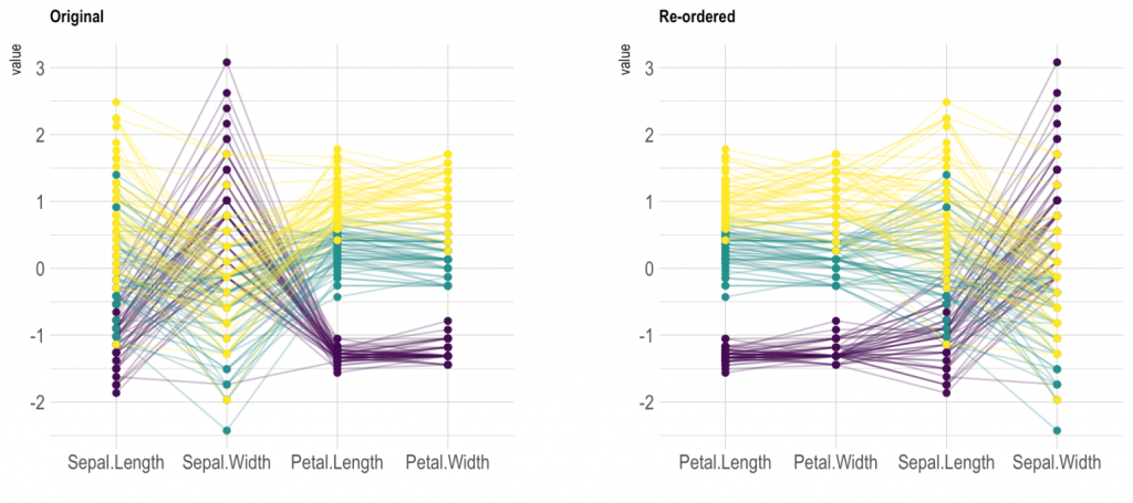
Users need to observe crossings of polylines to understand correlations between adjacent axes. In PCP technique, axes can be re-organized, and this operation is important to make similar axes be very close, then only adjacent axes can be compared. The system of the visual aids of a parallel coordinates display facilitates the understanding of the importance and quality metrics of individual variables. It is considered a major challenge to visualize multivariate data sets with a large number of variables. Previously, [17] implemented a set of quality metrics to examine the correlation, clusters, and outliers controlled by user-defined weight functions. The method introduced a dimensionality reduction system of multivariate data sets with large numbers of variables, which provided an interactive analysis of the whole data set based on quality metrics. Therefore, the reduction of the dataset considering the preservation of its important structures is highly important.
There are several challenges with PCPs. First, axes are compared only when they are adjacent. Second, overplotting is a big issue in big datasets as representing data needs a large mapping layout to avoid overlapped dots on the screen. Therefore, a reduction in plot lines should be carried out and that can be achieved through interactive filtering, data reduction (at the input) or removing of polylines through other methods
Example (2)
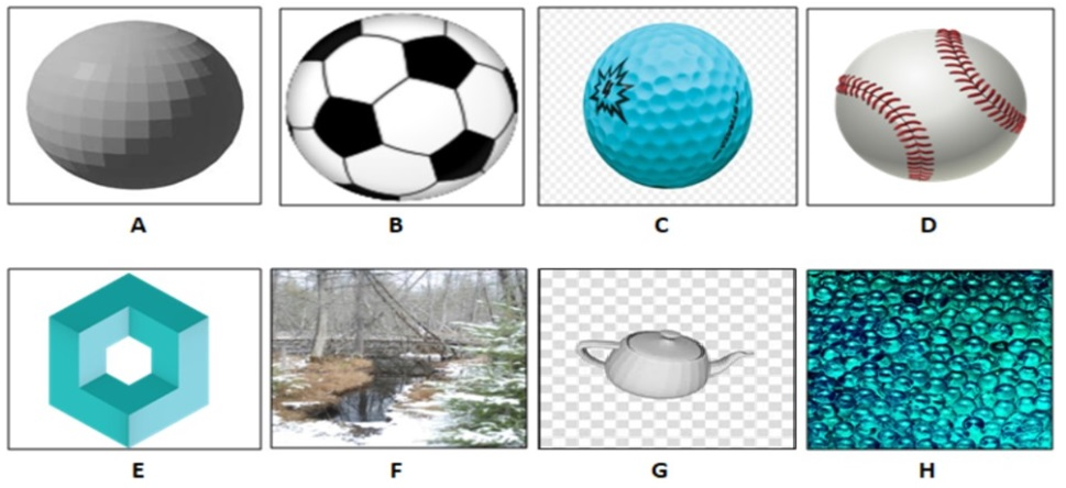
This example has taken from image measuring space to see the effectiveness of metrics on image comparison space. Zhou et al. [13] presented a set of image comparison metrics (11 metrics) to quantify the magnitude difference between the two images within the geometrical aspect. These metrics were described through three main categories (spatial domain, spatial-frequency domain, and perceptually-based domain). The author focused on the standard deviation to indicate similarities and differences in object properties.
As can be seen in (Fig. 3), which is similar to [13] example, the images (Fig. 3 B, C, and D) have high evaluation values in similarity with the reference object (the sphere model shown in Fig. 3 A) as identical shapes but different in texture. On the other hand, images (Fig. 3 F, G, H, and I) have high evaluation values in differences with the reference object in terms of geometry attributes. However, some properties of these objects can still cross with the reference object. Image (Fig. 3 E) is similar in object rendering but different in geometry.
Applying metrics in different domains
To understand the breadth of metrics in visualization, it is useful to investigate how metrics have been used in different domains. Two specific fields were studied in this research including Graph-based data display (graph drawing); in addition to multivariate and multidimensional data analysis field. These domains provide detail to mimic user’s tasks to create a better visualization that is more visually appealing. In other words, they are metrics that specifically measure the characteristics of visual design.
Graph-drawing and graph-based data metrics
Graphs describe the relationships between entities. The basic principles of drawing graphs are similar in most graphs types. The goal of Graph-drawing methods mainly based on enhancing graph layout in a way to be aesthetically pleasing.
The impact of using metrics in graph drawing appears on the usability by reducing the complexity and enhancing the readability of the graph. In literature, different concepts are widely used in graph aesthetics perspective. Purchase [1] indicates that graph layout algorithms or metrics commonly conform to achieve a purpose (i.e. minimizing the number of bends, maximizing orthogonality, etc.). Furthermore, encoding aesthetics (e.g. the quantity of edge crossings, bends length, etc.) combined with modeling cognitive measurements in graph aesthetics also takes part in graph drawing algorithms [18].
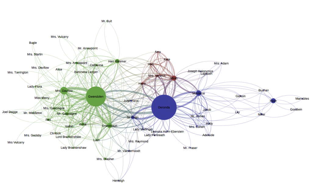
The readability of graph information is considered a preservation metric related to the perceptual aspect, particularly in large node-link graphs. In [19], generic tasks were conducted to compare two graph representation methods (i.e. node-link graph and matrix-based visualization graph) based on size and links density as comparison criteria. The study concluded that small node-link diagrams have a better readability metric and are familiar to the users. While matrices are suitable with large or dense graphs in order to reduce occlusion and node overlapping. Several metrics can be considered in different graph drawing such as the size of the node, color, edge length, and centrality. The network graph (Fig. 4) describes nodes as groups. Metrics are used to enhance the readability of the graph such as the size of the node to illustrate how important that person is to other people’s connections and centrality to show the significant place within the graph.
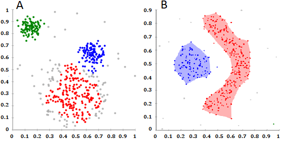
The clustered graph is another example of graph types. Clustering is performed on the graph to reduce visual complexity [20]. Generally, this method is used to discover grouping or classes in data based on a chosen semantic. Metrics are applied here as quality measures to find the paths for nodes or edges algorithmically [21]. The purpose of defining these measures is to optimize the views of clusters and allow users to retain the context of structure. Visualization techniques were used in that direction to help users in configuration graphs parameters towards efficient representation such as color and opacity enhancement, animation, and interaction. Several algorithms were implemented on cluster-based graphs such as force-directed method, divide-and-conquer approach, and others [22]. Cluster-base graph visualization involves various criteria to visualize clusters in an aesthetically appealing and understandable way. Density-based and grid-based clusters are the algorithms used to organize the distribution of scatter plots, underline edge patterns for the graphs, and support the separation of clusters as well. (Fig. 5) illustrates two views for clusters separation using density-based spatial clustering of applications with noise. Geometry-based clustering uses such quality metrics to reveal a good or bad capturing set of paths by applying a smoothing scheme to perform clustering, optimize clusters views, and reduce complexity [23].
Multivariate and dimensional Data
Multivariate data sets consist of hundreds of different types of variables. Metrics with multivariate data are used to evaluate the quality of the displayed data. For example, the analysis of questionnaire data produces hundreds of variables due to the various answers [16]. Typical techniques such as parallel coordinates; scatter plots matrix; and table lens are used to represent n-dimensions of datasets [15][24]. All these techniques use different metrics for different purposes to enhance the quality of huge data rendering.
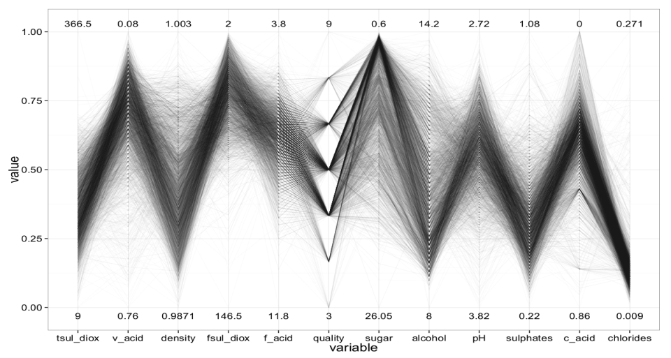
The purpose of setting different metrics with this type of data is to promote and optimize the depicting data points on the screen with less confusion or distortion. This helps users to get the full meaning and to identify the interesting patterns along with a qualitative understanding of information. Regarding the previous aspects, metrics can be used as a tool to enhance rendering by carrying out different tasks, for example, clutter reduction [17] and outliers’ detection. Furthermore, minimizing dimensions is considered a better method to reduce the size of data by selecting important variables in data set using reordering dimensions technique, which also reduces clutter [25] without losing information. (Fig. 6) shows the wine data set to display 4866 samples when performing re-ordering task the dimensions are rendered in an optimized view with clear structure [26].
One important application of data-visualization metrics is to improve visual clutter within the visualization. In particular, over-plotting is a big challenge for data-visualization designers, especially with the growth and widespread interest in big data where many data points inevitably end up being located on the same screen pixel point. The art of removing unnoticeable or less salient features in the display is therefore crucial for developers. Metrics can be used to iteratively control this refinement process; such as simplify parallel coordinate plots to display salient information.
Conclusions
This paper introduced a short review of the role of metrics in visualization and identified different types of metrics in various domains. Metrics are useful tools to help users focus on what is important in a timely speed. They also can be helpful to focus the users’ attention on important and salient features that may have not been noticed and utilized to create better-designed data visualizations. It is possible to say that metrics of visualization can be used in data analysis in order to build classification structures or observe identifiers. All these benefits have rendered metrics as an instrument with high potentials in different scopes of data visualization for current and future uses.
References
| 1 | Purchase HC. Metrics for graph drawing aesthetics. J Vis Lang Comput. 2002;13(5):501-16. DOI |
| 2 | Harrison L, Yang F, Franconeri S, Chang R. Ranking visualizations of correlation using weber’s law. IEEE Trans. Vis. Comput. Graphics. 2014 ;20(12):1943-52. DOI |
| 3 | Zhou H, Yuan X, Qu H, Cui W, Chen B. Visual clustering in parallel coordinates. Comput. Graph. Forum. Oxford, UK: Blackwell Publishing Ltd. 2008;27(3):1047-54. DOI |
| 4 | Tufte ER. The visual display of quantitative information. Cheshire, CT: Graphics press; 2001:20,32,76,94. |
| 5 | Brath R. Metrics for effective information visualization. Proceedings of VIZ’97: Information Visualization and Parallel Rendering Symposium. IEEE. 1997:108-11. |
| 6 | Tory M, Moller T. Rethinking visualization: A high-level taxonomy. IEEE Symposium on Information Visualization 2004:151-8. DOI |
| 7 | Alam MJ, Kobourov SG, Veeramoni S. Quantitative measures for cartogram generation techniques. Comput. Graph. Forum 2015;34(3):351-60. DOI |
| 8 | Duffy B, Dasgupta A, Kosara R, Walton S, Chen M. Measuring Visual Complexity of Cluster-Based Visualizations. arXiv preprint arXiv:1302.5824. 2013. |
| 9 | Johansson J, Forsell C, Lind M, Cooper M. Perceiving patterns in parallel coordinates: determining thresholds for identification of relationships. Information Visualization. 2008 ; 7(2):152-62. DOI |
| 10 | Demiralp Ç, Bernstein MS, Heer J. Learning perceptual kernels for visualization design. IEEE Trans. Vis. Comput. Graphics. 2014 ; 20(12):1933-42. DOI |
| 11 | Preiss J, Fernandes F, Urban P. Color-image quality assessment: From prediction to optimization. EEE Trans. Image Process. 2014 ; 23(3):1366-78. DOI |
| 12 | Ponomarenko N, Lukin V, Egiazarian K, Astola J, Carli M, Battisti F. Color image database for evaluation of image quality metrics. IEEE workshop on multimedia signal processing 2008:403-8. DOI |
| 13 | Zhou H, Chen M, Webster MF. Comparative evaluation of visualization and experimental results using image comparison metrics. VIS’2002. IEEE. 2002:315-22. DOI |
| 14 | Keller T, Gerjets P, Scheiter K, Garsoffky B. Information visualizations for knowledge acquisition: The impact of dimensionality and color coding Comput. Hum. Behav. 2006 ; 22(1):43-65. DOI |
| 15 | Alnjar H. R., “Analysis and synthesis of critical design-thinking for data visualisation designers and learners.,” Prifysgol Bangor University. 2017. |
| 16 | Inselberg A, Dimsdale B. Parallel coordinates: a tool for visualizing multi-dimensional geometry. Proceedings VIS’90 . IEEE.1990:361-78. DOI |
| 17 | Grinstein G, Trutschl M, Cvek U. High-dimensional visualizations. Proceedings of the Visual Data Mining Workshop, KDD 2001;2:120. |
| 18 | Keim DA, Kriegel HP. VisDB: Database exploration using multidimensional visualization. IEEE Comput Graph Appl. 1994 ;14(5):40-9. DOI |
| 19 | Ware C, Purchase H, Colpoys L, McGill M. Cognitive measurements of graph aesthetics. Inform. Visual. 2002;1(2):103-10. DOI |
| 20 | Ghoniem M, Fekete JD, Castagliola P. A comparison of the readability of graphs using node-link and matrix-based representations. IEEE Symposium on Information Visualization 2004:17-24. DOI |
| 21 | Roxborough T, Sen A. Graph clustering using multiway ratio cut (Software demonstration). International Symposium on Graph Drawing. Springer, Berlin.1997 :291-6. DOI |
| 22 | Brown AW, Kaiser KA, Allison DB. Issues with data and analyses: Errors, underlying themes, and potential solutions. Proceedings of the National Academy of Sciences. 2018; 115(11):2563-70. DOI |
| 23 | Walker JQ. A node‐positioning algorithm for general trees. Software: Practice and Experience. 1990;20(7):685-705. DOI |
| 24 | Cui W, Zhou H, Qu H, Wong PC, Li X. Geometry-based edge clustering for graph visualization. IEEE Trans. Vis. Comput. Graphics. 2008 ;14(6):1277-84. DOI |
| 25 | Johansson S, Johansson J. Interactive dimensionality reduction through user-defined combinations of quality metrics. IEEE Trans. Vis. Comput. Graphics. 2009 ;15(6):993-1000. DOI |
| 26 | Thill M. Visualizing High-Dimensional Data With Parallel Coordinates [Internet]. 2017 Nov 07 [cited 2020 Mar 20]. Available from: Link |
Cite this article:
Alnjar, H. Data visualization metrics between theoretic view and real implementations: A review. DYSONA – Applied Science, 2020;1(2): 43-50. doi: 10.30493/das.2020.216111
